Avoiding UX Fragmentation When Building Business Central Extensions

Many companies use Microsoft Dynamics 365 Business Central because it’s flexible. You can build “extensions” to add features or customise the system. But when there are many extensions from different teams, a problem can appear: UX Fragmentation.
This means the interface and experience can feel inconsistent between extensions, making the system harder for users.
Let’s dive into UX fragmentation on Business Central extensions.
What is UX Fragmentation?
UX Fragmentation happens when different extensions use different ways of doing things in Business Central.
Developers might use different:
- Names for similar things.
- Locations or arrangements for actions and fields.
- Terms, shortcuts, icons, or workflows.
- Ways to show notifications or messages.
- Validation style and error messaging.
- Tooltips and documentations.
This confuses users because it feels like they’re using several different apps instead of one unified system.
What UX Fragmentation Looks Like
You’ve likely come across this before.
- One extension calls it “Setup”, another calls it “Configuration”.
- One shows a FactBox, another opens a separate page.
- One puts pages in the menu action, another expects you to use Tell Me search.
- One creates new setup tables, another extends existing ones.
- One groups fields neatly, another leaves you scrolling down a long page.
- One shows notifications, another pops up message dialogs.
- One sounds friendly, another feels a bit too formal.
Each small difference adds up. The system feels messy, and users make more mistakes or waste time figuring things out.
Why Does This Happen?
Usually, it’s because different teams work on extensions without agreeing on common styles or rules. Each team builds what they think is best for their own feature, often without considering the bigger picture.
Why is This a Problem?
When UX fragmentation happens, users:
- Take longer to learn new features.
- Get frustrated navigating between different extensions.
- Can’t transfer their knowledge from one feature to another.
- Ask for more support because things work in unexpected ways.
As a result, users might complain, stop using features, or trust your company less.
Why Unified UX Matters
Making extensions feel and work similarly brings real benefits:
- Users finish tasks more easily (less confusion, fewer clicks).
- People are happier and more likely to use your extensions.
- You spend less time on support and onboarding.
- Your brand looks polished and professional, which helps you stand out.
What You Can Do as a Developer or Partner
Even if you can’t control how other companies design their extensions, you can:
- Agree on naming rules, tone, and design patterns across all your teams and extensions.
- Write clear, consistent error messages and tooltips.
- Do a UX review and test your extensions for consistency.
- Give your team a set of UX guidelines.
- Encourage your team to stick to shared design guidelines.
This helps both your teams and users, and it will improve your reputation.
You should also consider how your extensions work together in the same environment. Look for:
- Overlapping features or duplicated controls.
- Crowded pages with too many fields, FactBoxes, or actions.
- Performance issues caused by multiple active features.
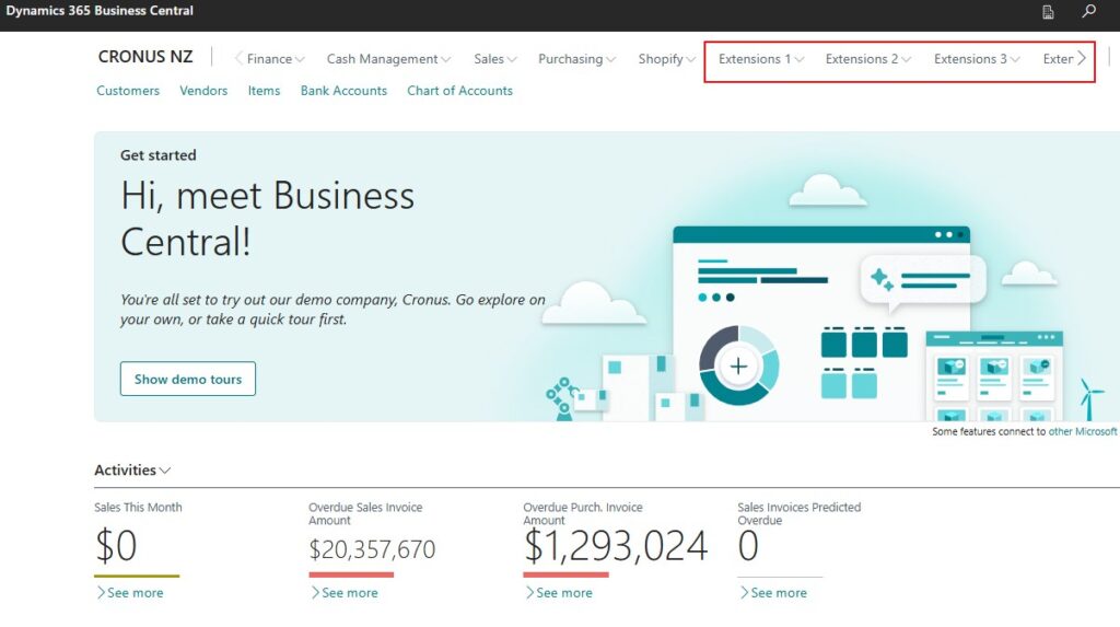
- Conflicting navigation, like duplicated menus or setup pages.
- Similar field names or actions with different functions that can confuse users.
Plan your extensions to complement each other. Keep the interface clean, fast, and predictable. Your users will feel the difference.
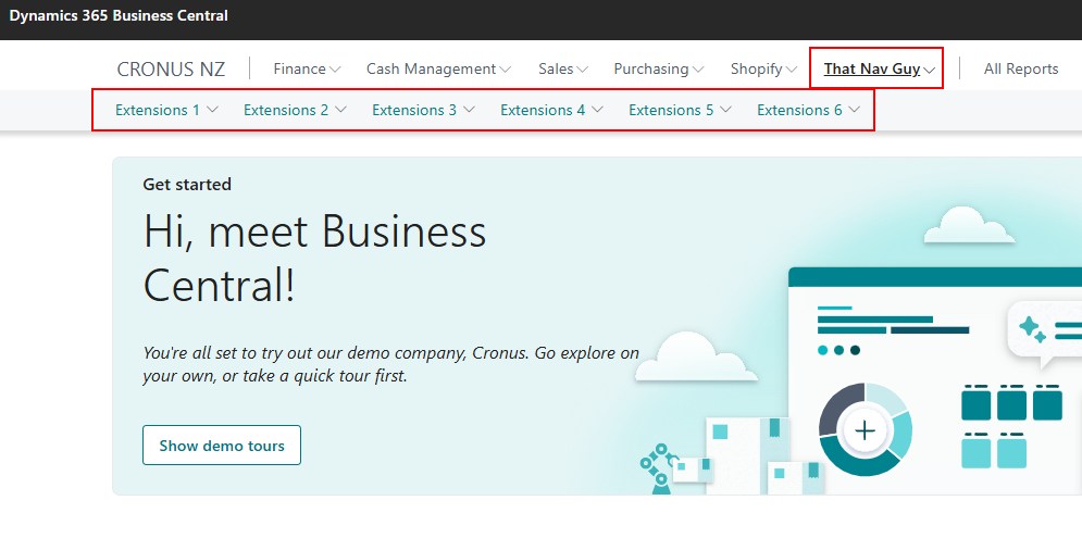
For example, instead of adding a Navigation Menu per extension, combine them into one shared menu. Your users will navigate faster, and your environment will stay organised.


Final Thoughts
While Microsoft continues to improve the Business Central platform with better UI tools and guidelines, the responsibility still lies heavily with partners and the developers. By making consistency part of your process, you make Business Central easier and better for everyone.


