The UX Gap: Why Good Functionality Isn’t Enough
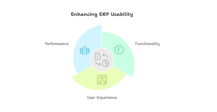
Enterprise Resource Planning (ERP) systems like Microsoft Dynamics 365 Business Central are designed to seamlessly manage complex business processes. Yet, even with robust functionality, users often feel frustrated. Why? Because functionality alone doesn’t guarantee usability.
A system may check all the boxes on paper but still feel clunky, unintuitive, or slow in practice. No one logs into Business Central excited about its backend code. Users care about one thing: getting their work done quickly and efficiently.
This post introduces a UX-focused series I’ll run over the next few months. We’ll dive into the User Experience (UX) aspects of implementing Business Central, exploring common pitfalls that hinder usability and providing actionable strategies to improve the user experience.
By the end of this series, I hope to inspire you to prioritize UX in your ERP implementations, making Business Central solutions that users enjoy working with.
When UX Falls Short
Poor user experience (UX) can have significant consequences for businesses:
- Increased errors: Confusing interfaces lead to mistakes.
- Slower processes: Tasks take longer than they should.
- Frustrated users: Even a technically “working” system can feel like a nightmare.
Good UX bridges the gap between a system’s capabilities and its ease of use. But it’s not just about sleek designs or flashy features—it’s about intuitive workflows, minimal friction, and clear communication.
The Cost of Poor UX
Bad UX isn’t just an annoyance; it’s a business liability. Here’s why:
- Productivity loss: Complex navigation and unnecessary steps waste valuable time.
- Higher training costs: A confusing system requires more extensive onboarding.
- Workarounds and inefficiencies: Employees often bypass difficult-to-use features, leading to inconsistent data and reduced ROI.
- Low adoption rates: If users avoid parts of the system altogether, your investment is underutilized.
For example, if a feature requires five steps instead of two, how much cumulative time is wasted across an entire organization? Multiply that by hundreds of employees over months or years, and the inefficiency becomes staggering. Every moment a user pauses to figure out what to do next is a break in their workflow and a missed opportunity for productivity.
Improving UX in Business Central
Improving the user experience doesn’t always require big changes. Small adjustments can yield significant results. While there are limitations on what you can do, there are still things that you can do. Here are some simple strategies to use:
- Simplify navigation: Ensure users instinctively know where to go next.
- Use clear labels: Avoid jargon or ambiguous terminology that slows users down. Be consistent.
- Eliminate unnecessary steps: Every field or click should serve a purpose.
- Provide feedback: Notify users when actions succeed or guide them when something goes wrong.
- Cut back on features: Too many features can overwhelm users, making it hard to find what they need.
- Leverage dashboards and FactBoxes: Offer quick insights into related information without cluttering the interface.
- Understand user diversity: Involve different user roles, not just admins or superusers, in the design process.
- Use non-intrusive notifications: When possible, replace disruptive pop-ups message with non-intrusive notifications that users can enable or disable.
Small Changes, Big Impact
The good news? You don’t need to rebuild your solution from scratch to improve usability. Simple adjustments—like optimising tab and field orders, streamlining forms, or using default values strategically—can make a noticeable difference.
A well-designed system feels effortless to use. And when employees enjoy interacting with their tools, they work faster, make fewer mistakes, and fully leverage the ERP’s capabilities.
Key Questions to Ask
To create a solutions that users love, start by asking:
- Is this process intuitive for all user roles?
- Are there unnecessary clicks, steps, or fields that can be eliminated?
- Are we providing clear guidance and feedback during interaction?
- Does the system support users in completing tasks quickly and accurately?
- Are there features or tools that users frequently use but difficult to find?
- Are error messages clear, actionable, and easy to understand?
Then iterate, test with real users, and refine based on their feedback.
Great UX isn’t built overnight—it’s an ongoing process of improvement. By focusing on usability alongside functionality, you can transform your solution from frustrating tools into powerful enablers of productivity and satisfaction.
After all, the best systems aren’t just functional—they’re delightful to use.